HARVARD MEDICAL SCHOOL
Case Study—
Bioinformatics Collaboration Tool
Pedro is writing a paper on computational biology for a publication at Harvard. He's exhausted all of his resources at his school but remembers a former colleague that might have some information that would be useful for his research.
During Pedro's first semester as an undergrad, he met a woman who was a bioinformatics researcher at the University of California, San Francisco. This academic rendezvous took place long ago, and for the life of him can't remember her name and, thus, how to collaborate with her. The only solution was to peruse a human resources database at UCSF that housed 14,000 online resumes.
Interestingly enough, someone who could complement Pedro's research might be just across the quad, in the same building, or even on the same floor, and poor old Pedro wouldn't know it.
(Roles)
Lead UX/UI Designer
(Tools)
Whiteboard
Microsoft Visio
Adobe Photoshop
The Problem
In 2008 Harvard Medical School's Chief Technical Officer, Dr. Griffin Weber realized that with researchers spread throughout different departments and hospitals, "it could be challenging to find all the people working in your area—people with whom you might want to collaborate." (Nadis)
The problem between universities and medical institutions worldwide collaborating with their sacred findings from years of labored research was that there wasn't any true collaboration. Historically, sharing medical research data across institutional lines wasn't exactly a flood of moving water. Guarded, kept secret, or perhaps filed away in a dark basement, research findings weren't readily accessible. Coupled with the difficulty of finding a suitable person to work with was a Herculean feat.
The National Institute of Health (NIH) funded Harvard Medical School in the latter half of 2008 to create Harvard Catalyst Profiles. Our initial goal was to develop a pilot for an open-source data mining tool dedicated to advancing human health by supporting clinical and translational science.
The Proposed Solution
Our five-person team needed to develop something beyond just a search app. The product has to eventually be open source, an aggregator data mining tool that has excellent utility, analyzes white pages, and allows users to create professional connections with a social networking tool that they can share with researchers worldwide.
As a pilot, we created a multi-faced search portal that uses advanced algorithms beyond basic directory information to pull all professional connections individuals have accrued into a snapshot.
When we secured additional funding from the NIH, we continued to progress in making the search and filtering capacity more robust and began to employ UX strategy to encourage collaboration.
Note that social media was in its infancy in 2008. Popular social media back then was Alta Vista, AOL, MySpace, and not Facebook. We designed a passive and active networking component reminiscent of social networking to encourage collaboration. Additionally, concepts from ‘Gamification’ and ‘Social Proofing’ were used to entice users to participate and engage with our product.
Who?
Faculty, scientists, and students in academia.
What?
It’s hard to find suitable or people with the required expertise for collaboration.
Where?
To be used in hospitals, schools, and learning institutions on desktop machines.
Why?
The bottleneck to furthering the advancement of healthcare needs to be solved.
Problem Statement
I am a researcher who wants to write a paper, but I can’t find the right person with the required expertise to collaborate with, so I can publish a publication.
Researchers need to find a way to easily locate suitable collaborators so research papers can be published.
Who are our users?
Based on personal research, departmental roadmap meetings, stakeholder interviews, and personal field observations, I constructed a hybrid between proto and qualitative persona, serving as a baseline.
Our chief users were professors, students, scientists, and administrators within the medical space. These are members of academia within medicine, healthcare, and biotechnology. Skillsets may vary but tend to be ‘older doctors working late hours in the basement of a hospital. Mostly like staring at a 15” CRT monitor on an HP machine running Win 98 and IE6, if we’re lucky,’ as my director so eloquently stated.
Patterns observed within our target audience:
Busy people; Doctors, scientists, and professors I have met are usually extremely busy and pulled into many meetings between their classroom teaching.
Older people; Many are older and are polishing up their CVs, writing publications, and getting close to retirement but still are serving as mentors, collaborators, and speaking engagements. This is unique because there is a space with an active aging population.
Not tech-savvy; I kept seeing that the aging doctors were not tech-savvy, too busy, and often appointed juniors as proxies to complete work.
Different breed; In academia, doctors, scientists, and researchers behave differently than in ‘for-profit’ businesses; therefore, the variety of ages, gender, and personalities isn’t great.
Little media consumption; Again, these extremely late-night working people aren’t spending hours on the Sony PlayStation, new emerging social media like MySpace, or mobile devices (however, Blackberries were most commonly used).
Top User Tasks
Finding another researcher to collaborate with
Creating a profile
Use profiles to share with others
Conduct a deep search on research topics
Add/Edit my profile
Assign a proxy to add/edit my profile
Connect with a colleague, co-author, mentor
Create a report
Discover student opportunities
Get directory information about a person, department, or institution
Download vCards
Explore concepts, your co-authors, people, departments, relationships, URLs, publications
Why should faculty use Profiles?
Create a dynamic, engaging profile about your research.
Connect with others via social media, web, and video tools.
Showcase your work to potential students and funding agencies.
Add new expertise to your team.
Reveal new directions for your research.
Include your Profiles URL in your NIH biosketch.
Why should everyone else use Profiles?
Scientists can look for new collaborators.
Students can identify potential mentors.
Conference organizers can identify possible speakers.
Administrators can assemble committees.
Companies and organizations can build academic partnerships.
The public can learn about biomedical research at Harvard.
Challenge—
To get the ball rolling, how do we quickly encourage participation, collaboration, and overall approval with researchers and stakeholders to use our new product? We needed global adoption. That means we need nods of approval from way up the academic chain. Simply telling everyone to use this super cool new search tool for their research activities isn't enough. Yes, researchers would inevitably learn to embrace Catalyst Profiles, but we needed thunderous applause of validation from the elite Professors and Heads of Departments high above.
By employing a behavior tactic, we enticed the biomedical community by using a commonly used strategic 'dark pattern' called Social Proofing.
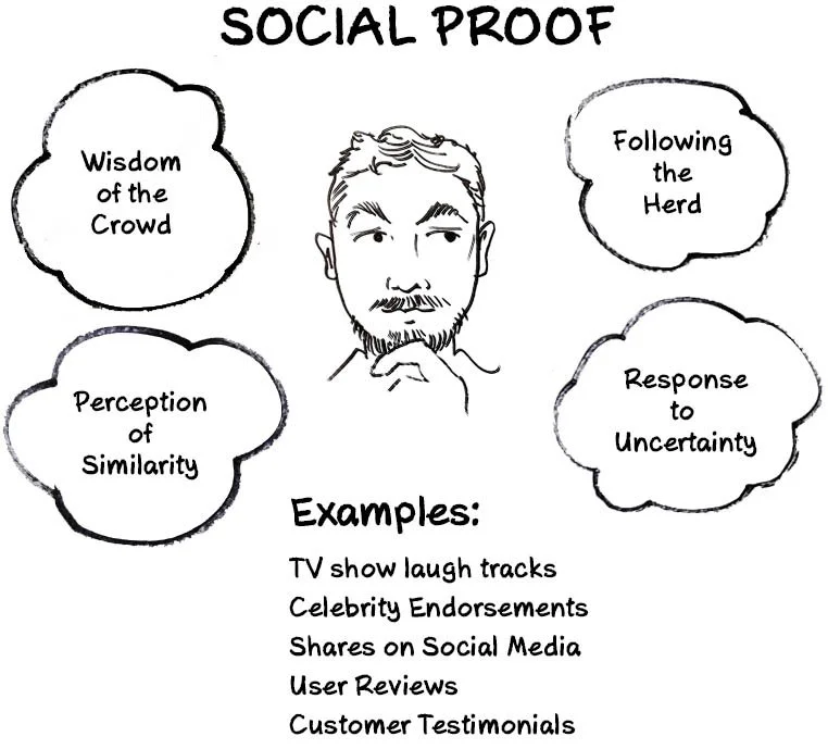
People, behaviorally speaking, try to identify what is good or correct by looking at what others think is good or correct. Social Proofing is the psychological and social phenomenon where people copy the actions of others because 'it must be right, legitimate, good or it's what expected of me to do too.' Leveraging social proofing was the core of our success.
Don't get me wrong. We did deliver on our promises of a robust deep search mining tool that creates engaging Profiles about one's research, connects with everyone in your academic career, and helps immensely with driving new research, funding, and possibly finding new cures. Much like a snowball effect, and speaking to being one of the most viewed websites in all of Harvard, we get close to 4 million impressions and 100,000 visits per month—social proofing did play its part in Catalyst Profiles' success.
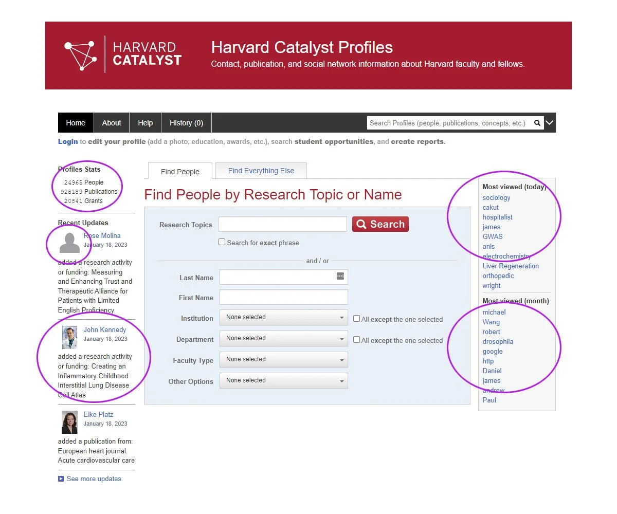
View the Catalyst Profiles home page below. On the left side column, you see recent updates on researchers working on their profile snapshot. These profile updates change on the homepage in real-time, dynamically. Same with the Profiles stats just above that. In the right side column is a list of the most viewed keywords used today and for the current month. This list, too, changes dynamically. The home page, in effect, is different each time a visitor arrives on the page and when a user updates their profile.
If someone doesn't include a photo for their profile display, we give them an unfinished treatment of a basic, grayed-out avatar. This sense of incompletion subliminally urges them to provide a photo of themselves to reach a level of completion or achieve a sense of finality. This dark pattern is an element of Gamification.
Gamification is the application of game-playing elements like point scoring, competition, and a sense of completing something for a reward. Leaving something visually unfinished only lures the user to come back and complete an action.
Social Proofing and Gamification are commonly used strategies to influence a person's behavior to get them to do something. Foursquare, Audible, LinkedIn, Facebook, Netflix, and video games, to name a few, all use these elements to get the user to do something. And this isn't a bad thing, considering that dark patterns help guide a user to a result that benefits both the user and the return on investment from the business' point of view.
Social Proof illustration by Marlon Violette
Harvard Catalyst Profiles Homepage
Relating to the screenshot above: Profile Stats, Recent Updates, a grayed-out avatar, and Most Viewed keywords and researcher names are dynamically driven, showing 'proof' and validation that other like-minded experts are busy editing, updating, or actively researching now. It suggests that if you're worth your salt, you should be doing the same thing too, and now.
How we got there
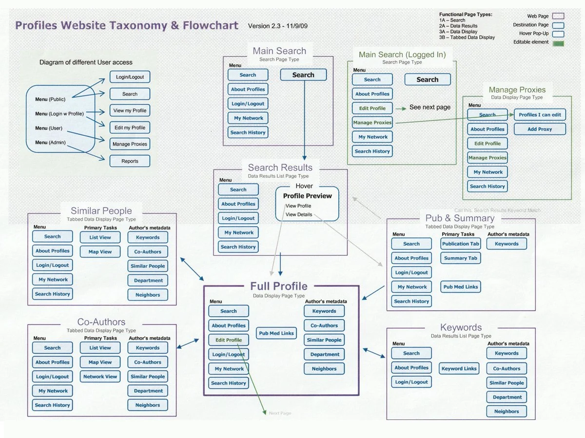
Solving the labyrinthine maze of potential user flows, the information architecture planning was challenging. Like a tree directory, every page opens a new section of pages. Below is a high-level first pass of a user flow diagram I created.
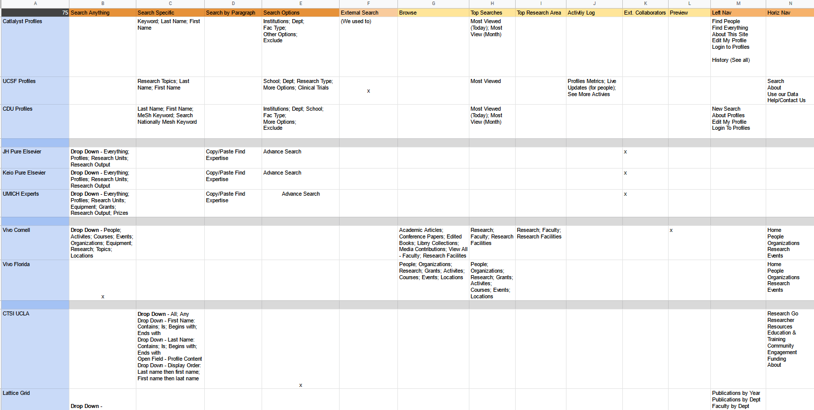
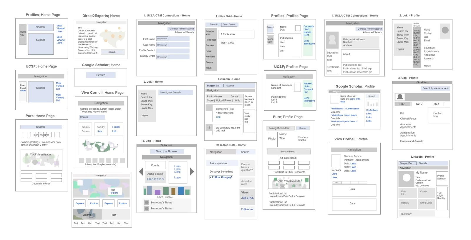
Competitive Analysis on Site Features: We needed to know what features to include or omit. Researching search tools from other schools gave us a good idea of how to shape our efforts best. The discovery of commonly used search features helped guide our efforts.
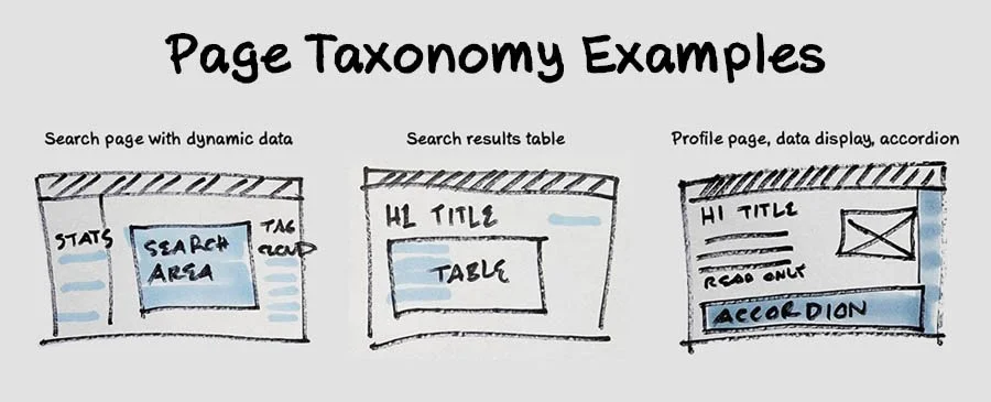
Page Taxonomy: My mental model for discovery and the team's shared understanding is what I call Page Taxonomy. Similar to a template but not treated as an asset. It's an exercise to stay stringent about how we create pages going forward. Page taxonomy is a page's actual type and purpose stripped down to the basics and the critical elements used.
This exercise helps address the following:
What is the primary purpose and reason for this page? If we need to add a new component later, is it scalable?
Are we duplicating a page type and designing ad-hoc?
Are we following proper architecture?
Are we reusing components properly?
The visual page taxonomy below is slightly modified to visually summarize the user's active areas regarding what is 'hot' versus what is read-only. Think, information prioritization.
Page Taxonomy diagram by Marlon Violette
Visual Hierarchy: The examples below demonstrate how other schools utilize visual hierarchy layout patterns or lack thereof. For context, common effective eye-movement patterns are the F-pattern and the Z-pattern. Catalyst Profile uses the tried-and-true F-pattern.
Wireframes: Without the distraction of color and for expediency, I created wireframes for team discussion and validation.
Visual Designs: Below are the first passes at mockups. The home page shown here is a concept page that the CTO enjoyed and used in the early rounds of preliminary conversations with various stakeholders.
The Final Designs
Through many iterations, versions, and cycles over the course of several years, we finally reached the final product. If you would like to see the current final product please visit the live website.
Additionally, we have some very cool interactive visualization tools, check them out!
Play with an interactive Radial Graph Check out this interactive Cluster Graph
Search Page: A researcher can search people, MeSH term, or concept.
Concepts Page: Cloud terms, categories and timelines details relevant concepts.
Search Results: ‘Why’ shows the properties and the value of keywords.
Co-Authors List Page: Work relationships between you and relevant colleagues.
Profile Page: Shows professional details and their networks to explore.
Co-Authors Map Page: Co-authors and people who have published papers together.
Co-Authors Details: Shows Co-authors’ most recent relevance.
Co-Authors Why Page: Shows connection strength between two co-authors.
Co-Authors Radial Graph: Shows Co-authors’ proportional connections.
Co-Authors Cluster Graph: Shows Co-authors’ proportional connections.
Co-Authors Timeline Graph: Shows Co-authors’ publication timelines.
Our office at HMS was a living whiteboard.
Wins—
Our cozy team of five built a successful open-source web app that makes collaborative research between institutions easy.
For over 10 years, Harvard Catalyst has provided training and support to thousands of early-career researchers from more than 250 institutions, including Harvard University's schools and affiliate academic healthcare centers.
Profiles Catalyst web app was successfully adopted by thousands of researchers worldwide, and to this day it is one of the most viewed websites in all of Harvard, receiving close to 4 million impressions and 100,000 visits per month.
Latest Press: Harvard Catalyst leads development of tools changing biomedical research - March 20, 2019
Losses—
Not having ideal access to more needed research opportunities was challenging to understand a wider breadth of users better. There was competition from other teams in creating this project; my boss advised secrecy.
How people engaged in their 'cell phones' in 2008 greatly differed from how people use their 'mobile devices' today. As bittersweet as it is, I saw a window of opportunity to start designing for mobile phone usage, but I was asked not to deviate from our requirements, as planning for mobile wasn't in the grant's description.
Fast forward 14 years later, in 2022, I heard my former team is considering a mobile solution for Catalyst Profiles. Due to the fixed 'desktop only' design I warned about, creating a responsive design today is akin to just building the app from scratch and starting all over.
Works cited:
Nadis, Steven. "Behind the Scenes - Harvard Catalyst Leads Development of Tool Changing Biomedical Research," Harvard Medical School News & Research,

