Pharmaceutical UX/UI Work
PALL CORPORATION
Work—
Interface for Antibody Production
On arriving mid-project at the Life Sciences division at Pall Corporation, I didn’t know I would design industrial machine interfaces. I met with scientists, engineers, and clients weekly, learning how they operate our product, a continuous train of antibody-producing machines. This assignment would be a unique design opportunity and a feather in my cap.
(Roles)
UX Design
Interactive Design
(Tools)
Axure
Adobe Photoshop
User Interaction
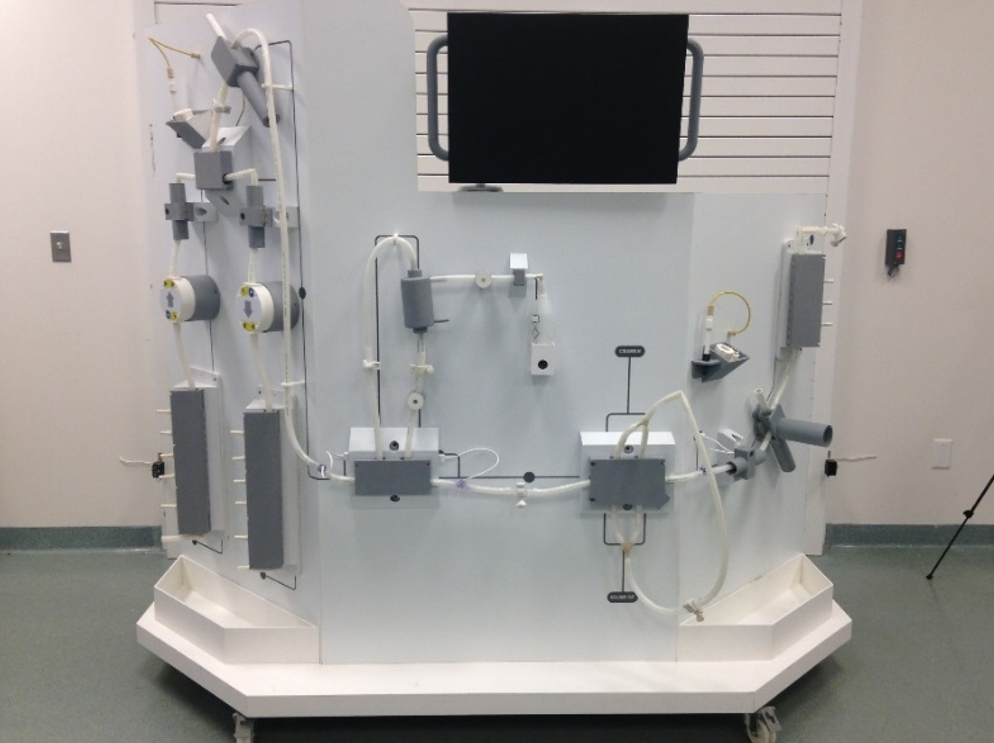
The first week I had to study these physical machines. Knowledge of how these machines worked informed us how we should create prototypes. The chemical filtration process's order and valves' timing were important. There was a system of carboys, sensors, tubes, filtration columns, and connection points.
The workplace that houses these machines is in a sterile laboratory environment, which must follow OSHA guidelines. Operators must wear hazardous materials suits. For example, the designers working on the machine design can't include a button on a machine where the operator has to kneel on the laboratory floor.
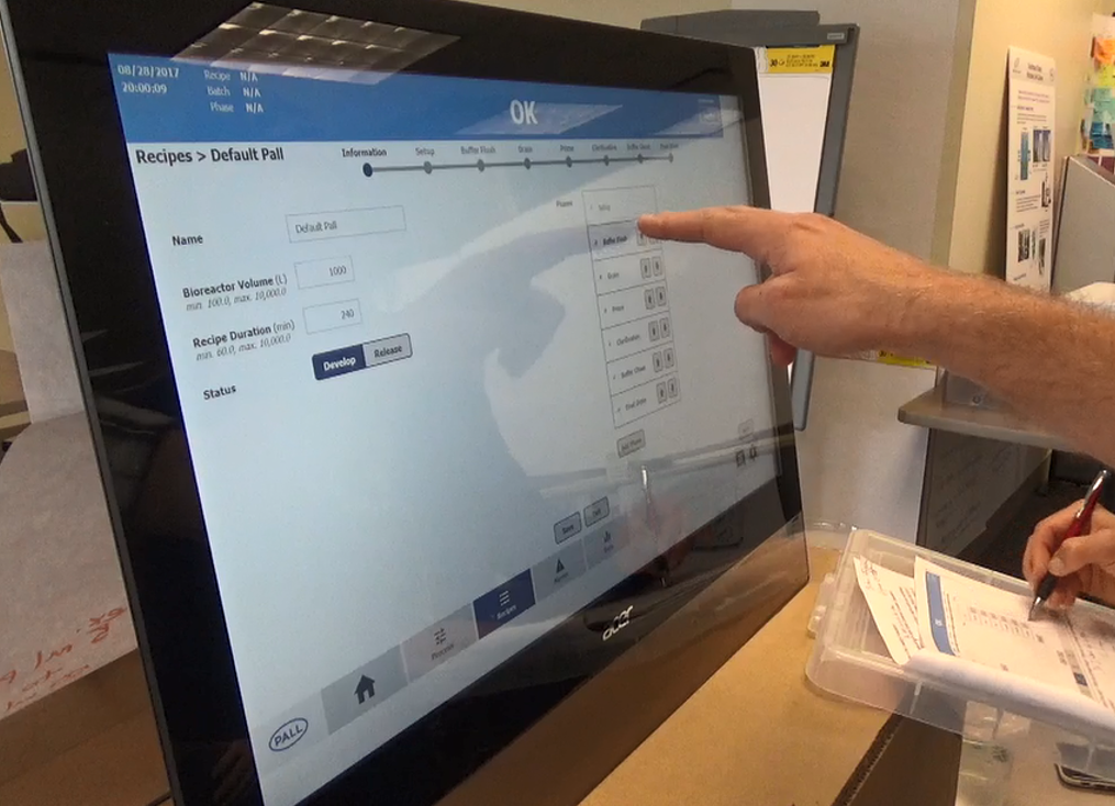
Because operators wear Haz-Mat suits, touching and operating an interface with bulky gloves provides a set of unique problems.
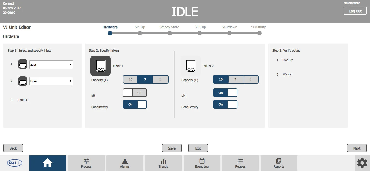
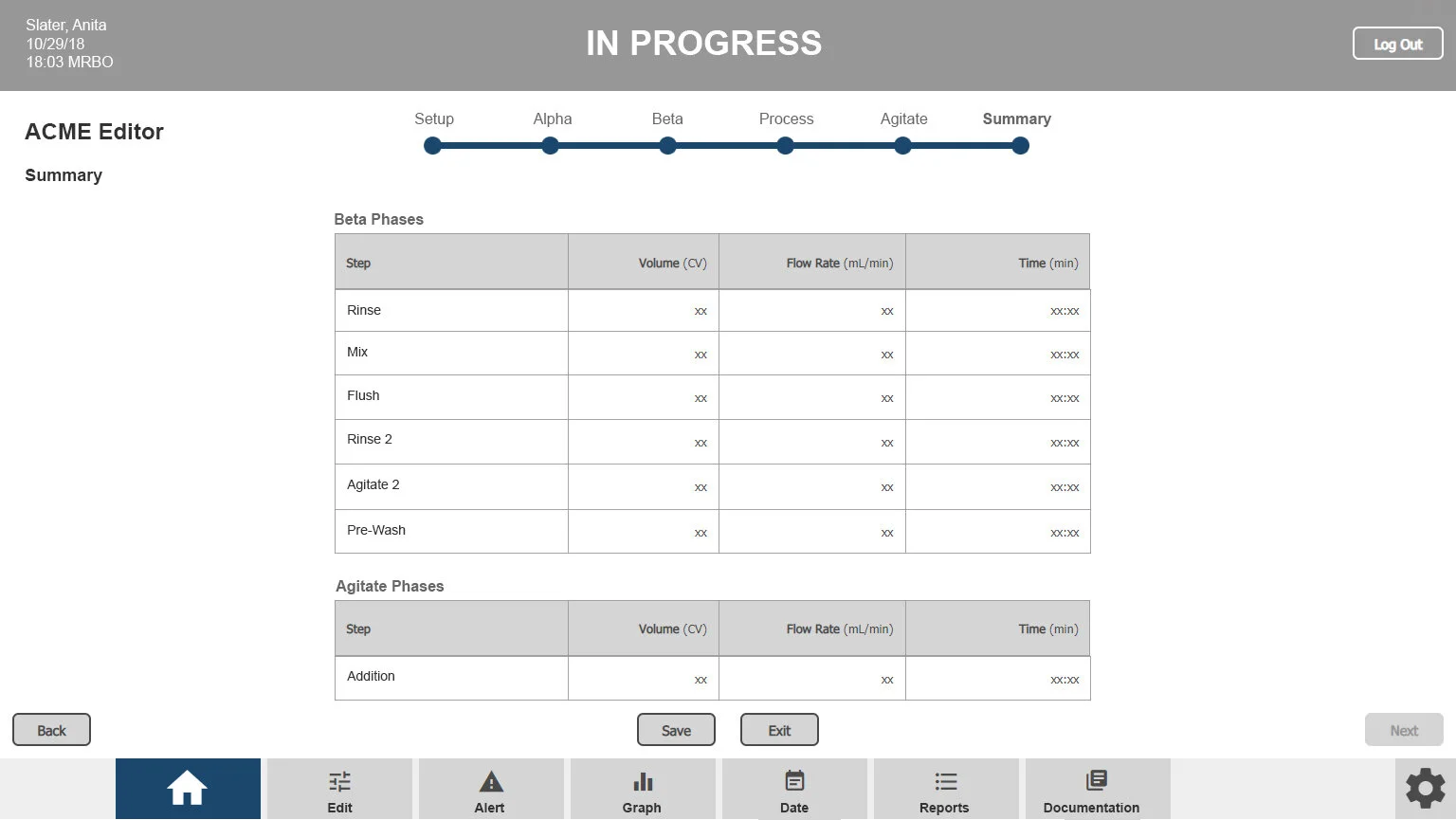
Easy-to-use screens, clear instructions, and labels, with large buttons with wide margins, templatized much of the design in the visual interface.
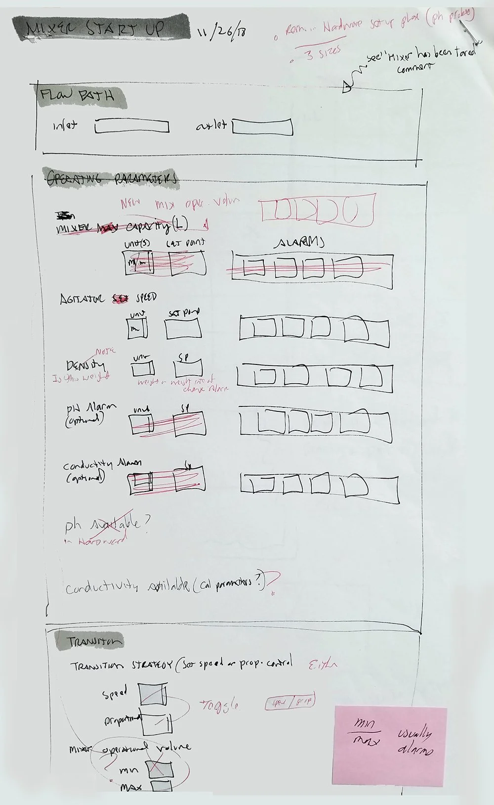
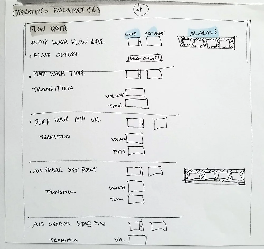
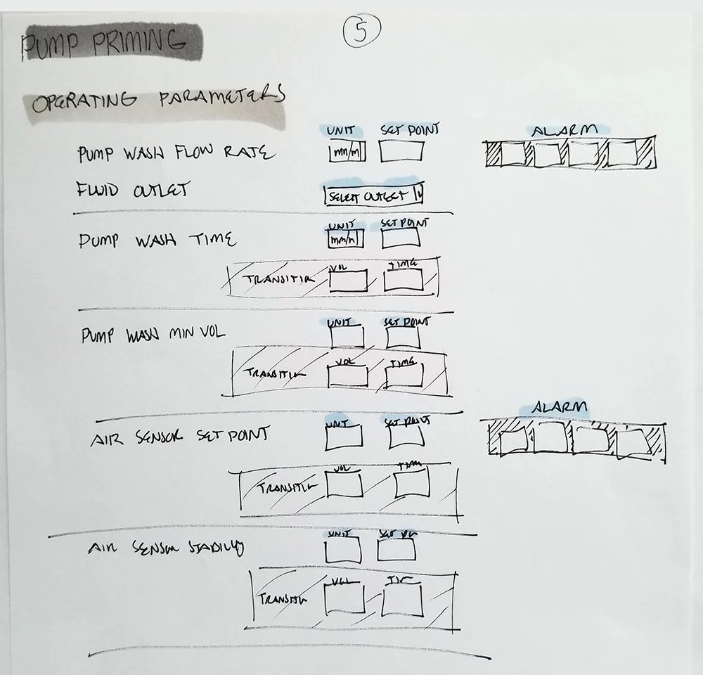
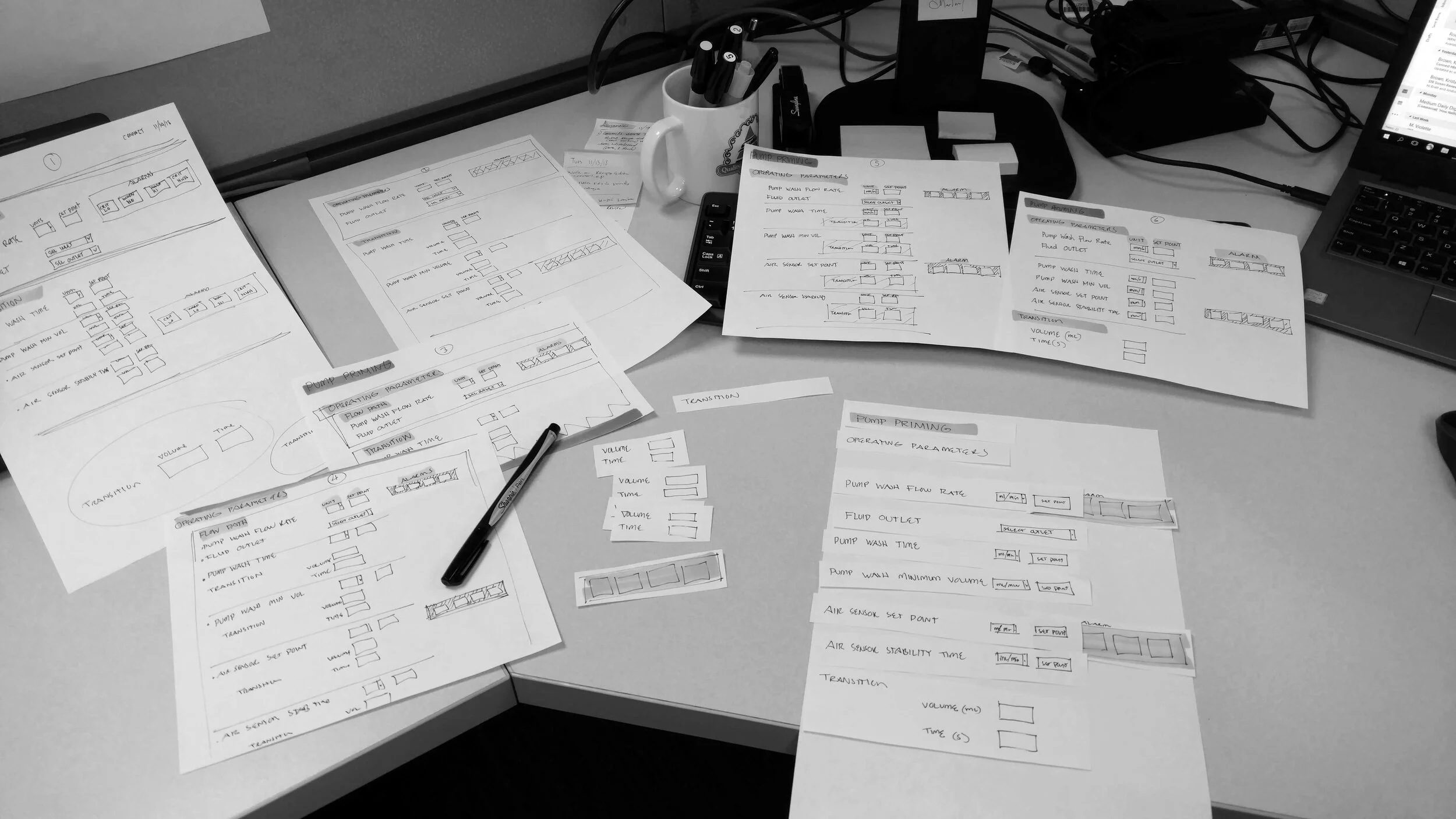
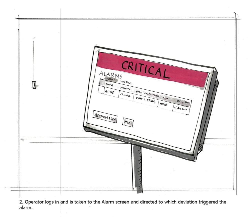
Ultimately, our job was to provide touchscreen prototype solutions for parameters for chemical mixing, temperature control, pH control, turning pumps on and off, alarm notifications, and time.
Challenge
Input came from teams consisting of engineers, scientists, clients, and the UX team. During meetings, we would discuss use cases and how operators use our product. Being afforded a large SME pool, shifting or oscillating requirements means constant re-alignment.
Translating what an operator needed to do to make an antibody recipe was complicated, as there were variants in how to use the product. To better understand this process, we had to be intimate with what the most common operator needed to do and what variables could be afforded.
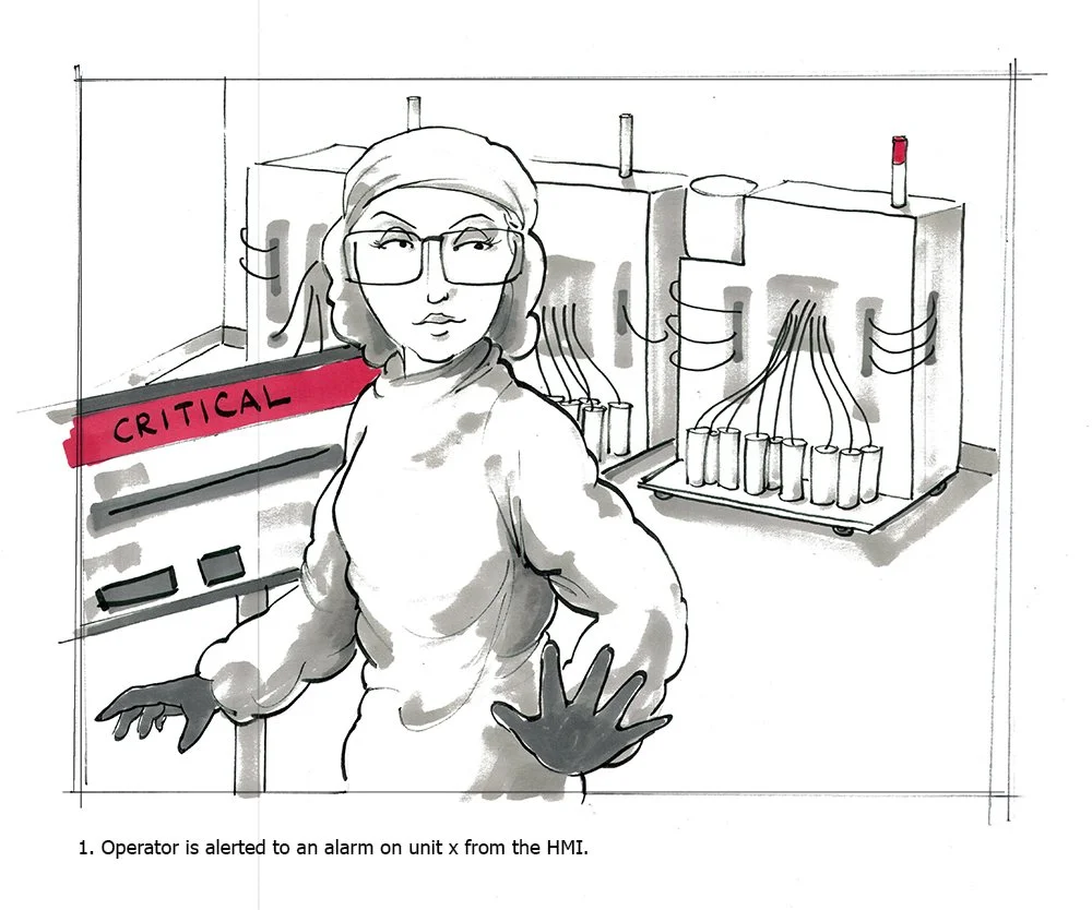
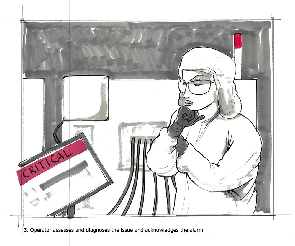
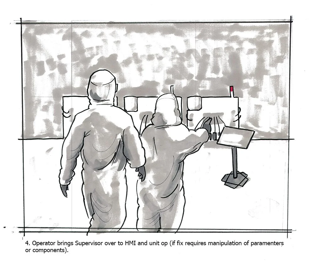
On top of designing a user flow, error scenario awareness is critical. One mistake can cost millions of dollars in a matter of minutes. How do you create an error system so a floor manager atop a stairwell 25 feet away can see and respond appropriately?
Like in many corporate environments, there wasn't a lot of shared understanding between the design team, the scientists, the engineers, and the developers. Exercises such as conducting UX workshops on user story presentations were essential to bring cross-disciplinary teams to align better.
UX Workshop - Demonstrating the value of user stories to dev
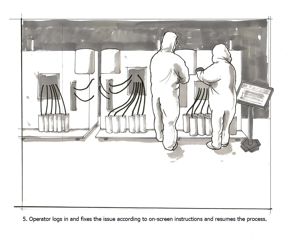
This is a compare and contrast diagram of a current batch process chain, versus a future batch process chain. Note improvements in the physical size, footprint, organized components, reduce tube clutter, ease of access, and simple modularity between the two examples.
This illustration I drew, help serve the monthly UX workshops our team conducted to elicit shared understanding and product illumination with our stakeholders and teams.
Evoke Mind+Matter
Work—
Advertising Agency Focused on Rare Diseases and Orphan Drugs
Executed UX strategy for a fast-paced, full-service global brand agency for pharmaceutical products. Deliverables include heuristic evaluations, website creation, email campaigns, touchscreen displays for tradeshows, and client presentations.
View Kyowa Kirin Cares
View About CTX (Health Care Providers)
View About CTX (Patients)
View interactive symptom checker I designed
(Roles)
UX Design
UI Design
Interactive Design
(Tools)
Axure
Sketch
InVision
Kyowa Kirin Cares: Client at Evoke Mind+Matter
Kyowa Kirin Cares offers personal and comprehensive support for patients, caregivers, and healthcare providers for patients with rare diseases. The products offered by Kyowa Kirin Cares are NOURIANZ, POTELIGEO, and SANCUSO.
Problem
Customers had difficulty finding clarity while researching medications, financial help, and finding support to treat their disease. This is because content strategy, calls to action, and clear titles and labels were never implemented.
Tasks
Re-defining user flows, navigation, calls-to-action, adding new content, and updating UI to pre-existing websites, on Kyowa Kirin Cares, Nourianz, Poteligeo, and Sancuso products.
Challenges
There are two audiences for the website; healthcare professionals and patients, each with different users, goals, and purposes. Both versions of the website had to appear unified and cohesive as a brand. But also clearly speak to healthcare providers with the correct voice of the industry, and with a click on a CTA, have the empathy of a loved one, urging to receive care if one is suffering from a rare disease.
The architecture of mobile navigation was not easy, given the dual nature of the product, and keeping user clarity.
Important Safety Information (ISI), must include the benefits and risks that a drug may have, have to appear in specific areas, and often cover up the screen real estate which may impede design.
(Hero images below credited to the visual design team)
AboutCTX: Client at Evoke Mind+Matter
Challenge
The existing website did not adhere to basic UX heuristics. The home page was an image, which is not suitable especially for SEO. Within, the three-column interior pages hinder comfortable reading for the user. The dense medical information needed to support drug literature, made quick scanning a nightmare.
Typical with drug websites, there are two distinct audiences; HealthCare Providers, Patients. Speaking with two tones for each audience but serving one goal is key.
Interactive symptom checker
Between the client and our team, we tossed around the idea of a symptom checklist for the patient. Something the patient can print and fill out, and bring to an initial appointment with their doctor to serve as a discussion point. After playing around with wires, I proposed the idea of having an interactive checklist. Our team loved the idea and shared my prototype with the client. He loved the idea. Fortunately, we were able to get development on board and create it, without any serious change to the timeline and staying within the client’s budget.
I’m happy to say that it’s still on the client’s website.
(Bitmap graphics re-drawn by me in vector format.)
AboutCTX.com is an informative site for Patients and Healthcare Professionals to learn about cerebrotendinous xanthomatosis (CTX)
Requirements
Client request for design lift
SEO
Update graphics
Update Layout
Visual Hierarchy
Improve CTAs
Update Important Safety Information (ISI) tray

