Evoke Mind + Matter
Exercise—
Client’s UX Audit
Remember the last time you used a website to find information on something, and it was extremely difficult to use and navigate?
A UX audit benefits both the customer and business by improving an experience to allow the customer to accomplish their goals. Based on established heuristics, this process is used to identify usability issues and friction points. An audit's findings are then translated into an improved customer experience that can help increase customer engagement, satisfaction, and conversions.
(Roles)
UX Design
UI Design
(Methods & Tools)
Competitive Analysis
Usability Testing Results
Sketch
Axure
Challenge—
The client didn’t have any original working files. Any changes to graphical elements had to be re-created. Also, they had a strict budget. A minimum viable product solution.
A standard for pharmaceutical companies, products are addressed to two audiences. One for the healthcare providers and the other for the patients. There are two doorways to the product experience. The content for each audience conveys a very separate and distinguished tone in the copy..
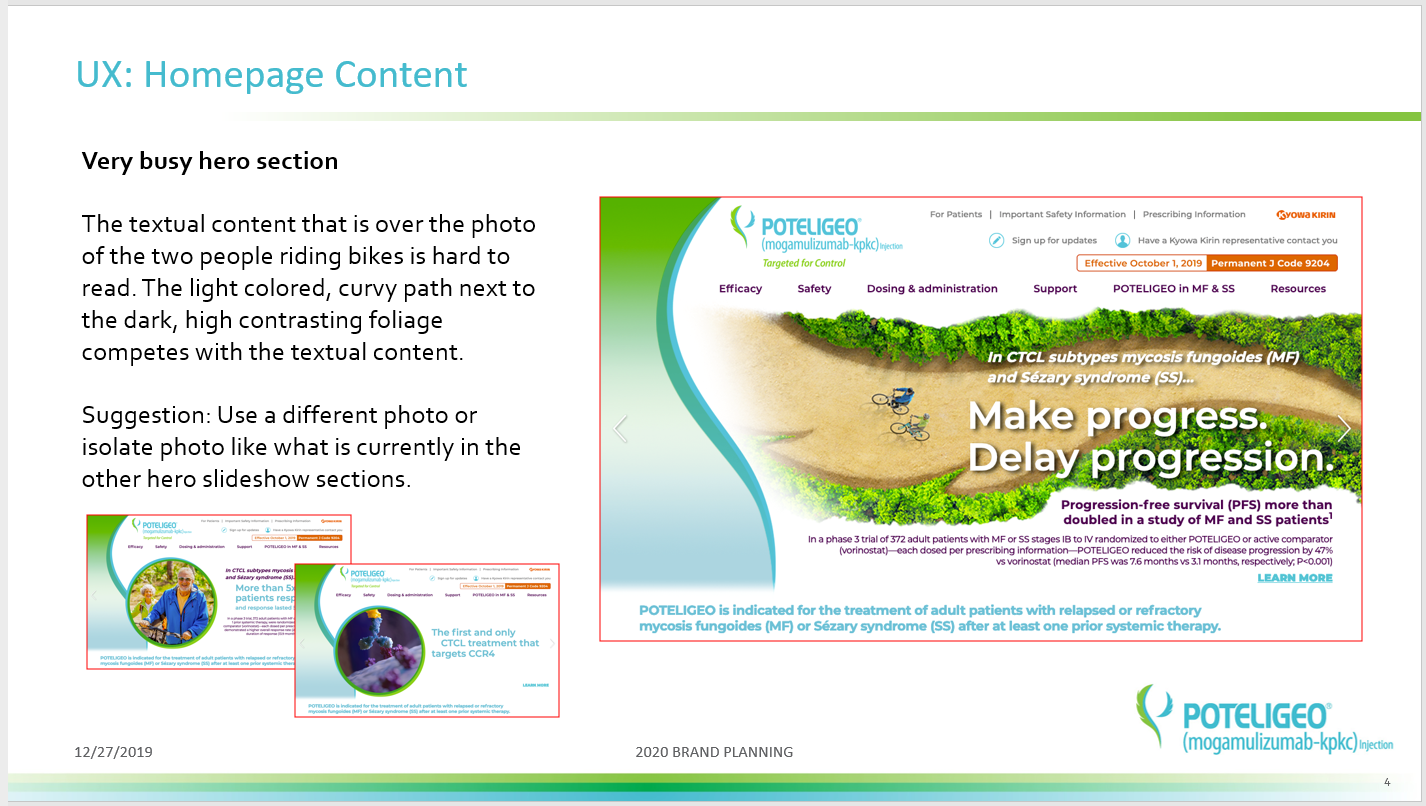
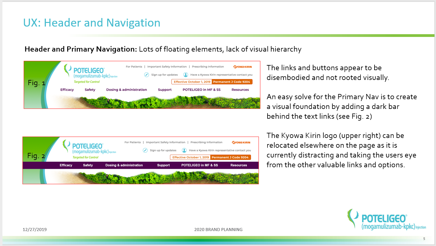
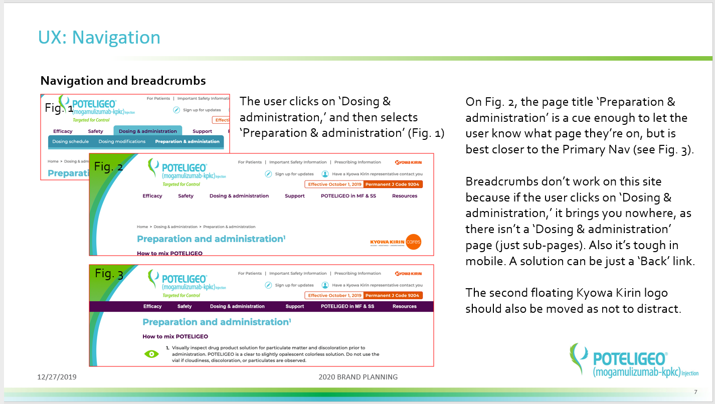
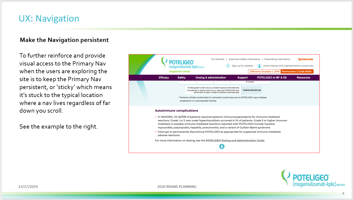
My UX audit revealed the following:
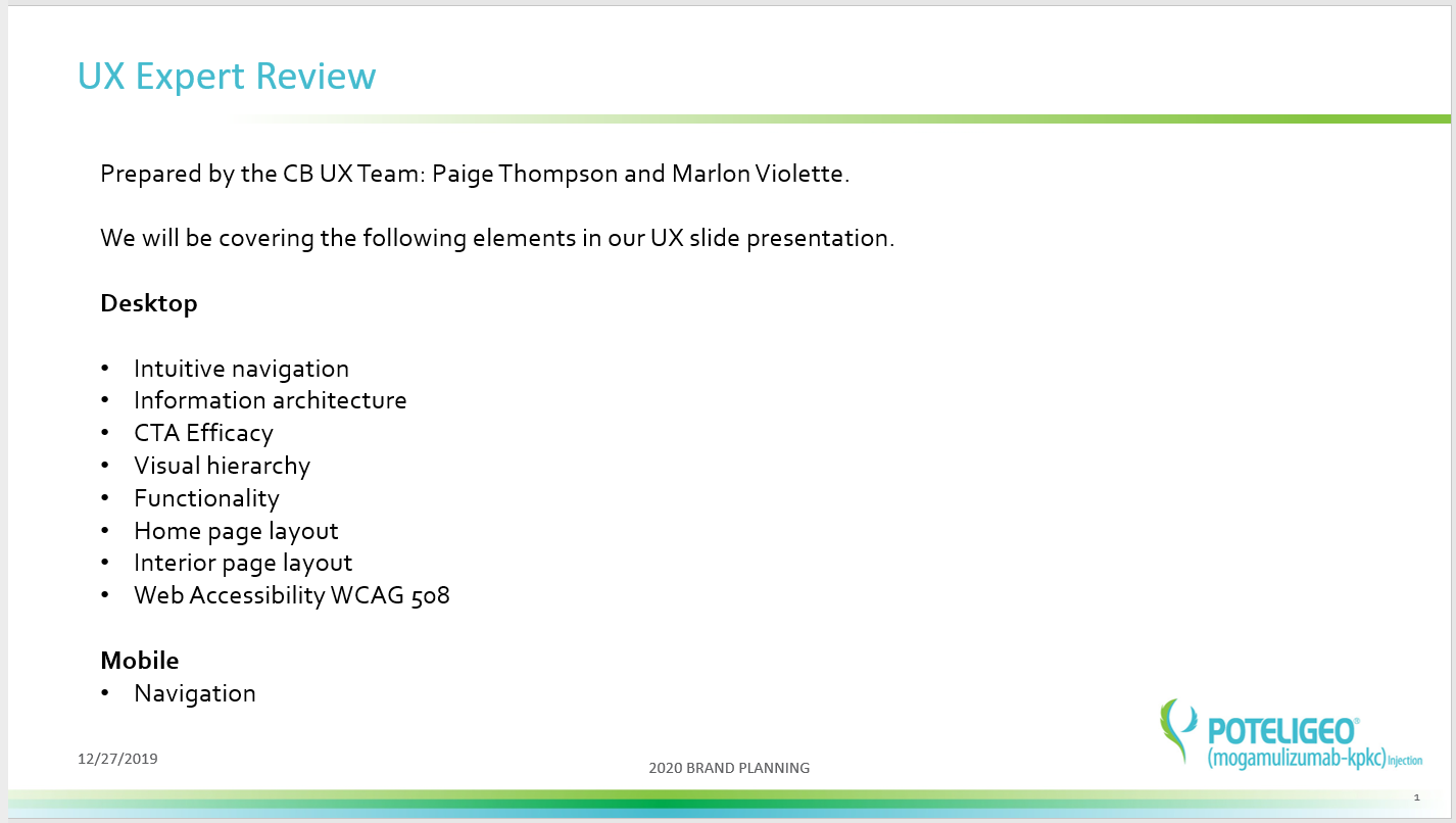
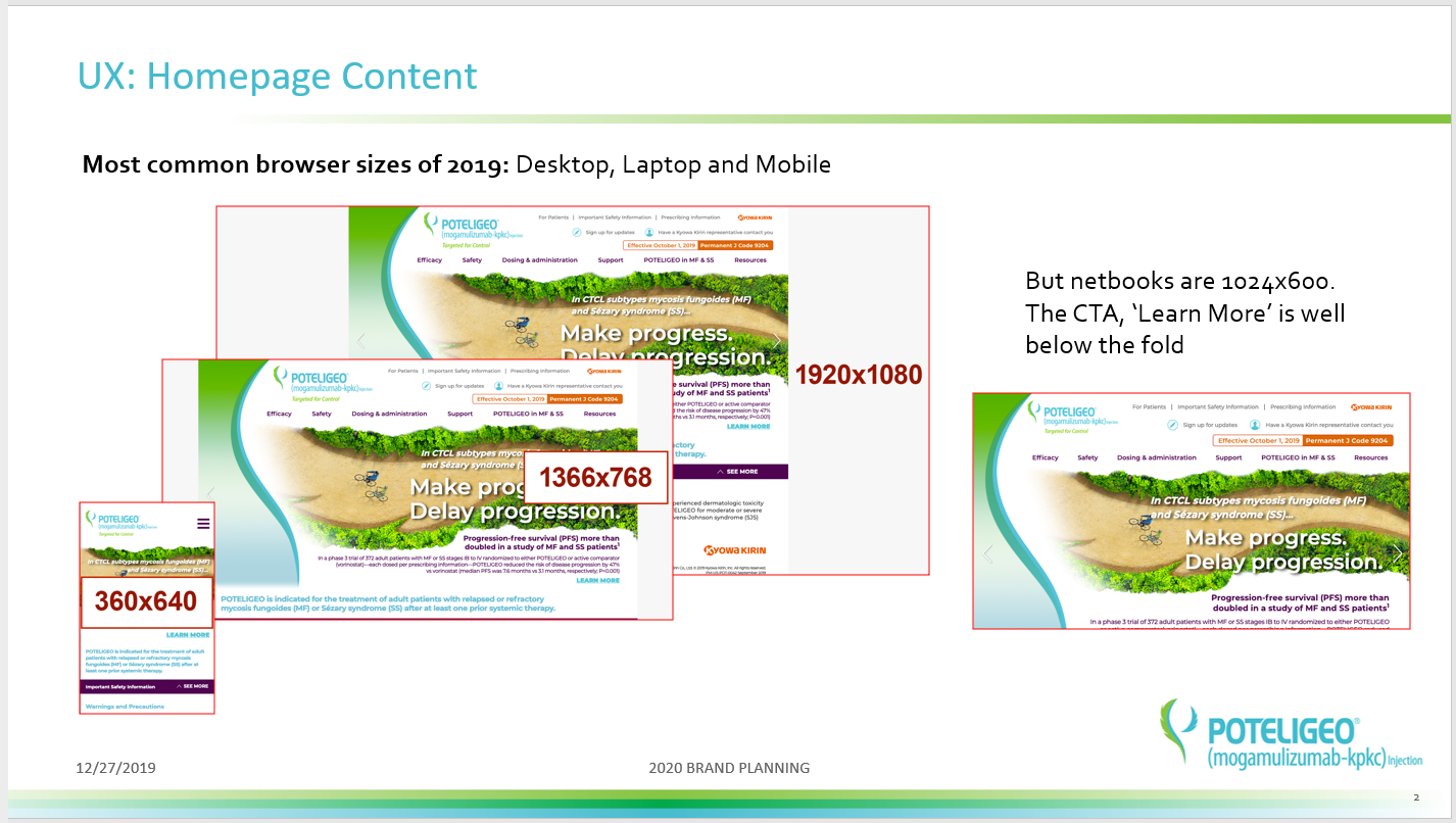
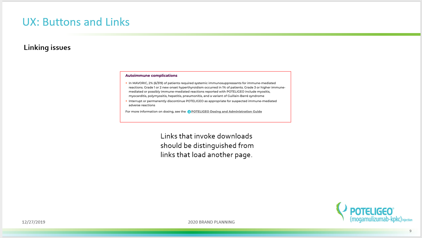
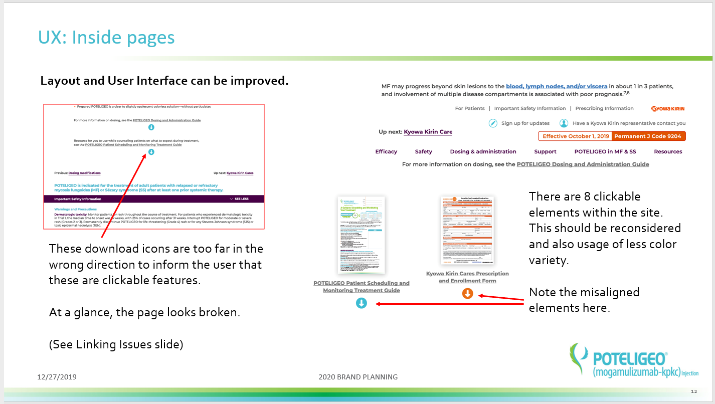
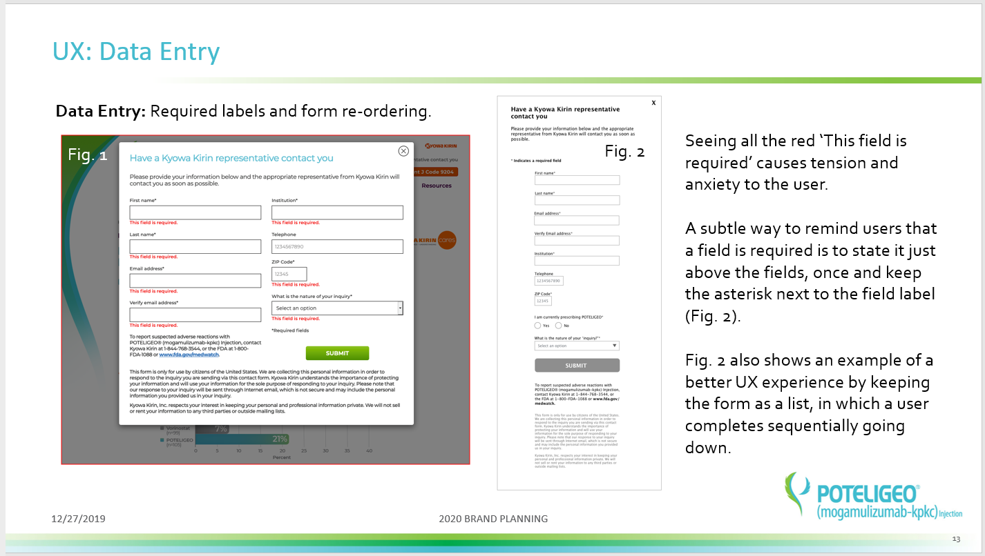
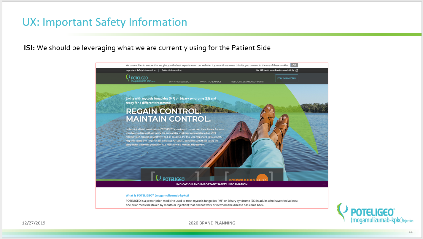
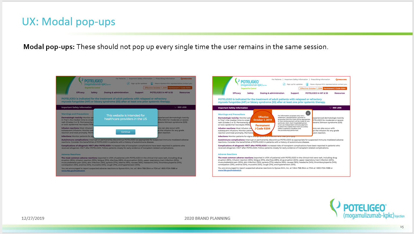
Confusing CTA
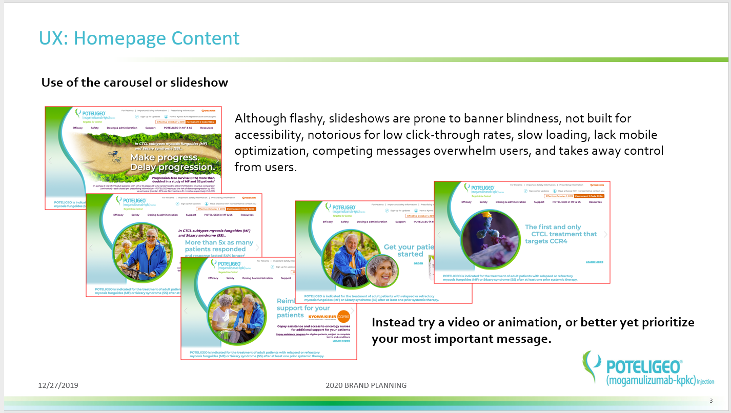
Lack of content strategy
Missed opportunities for promoting CTAs
A limited color palette (two primary colors used equally, for example)
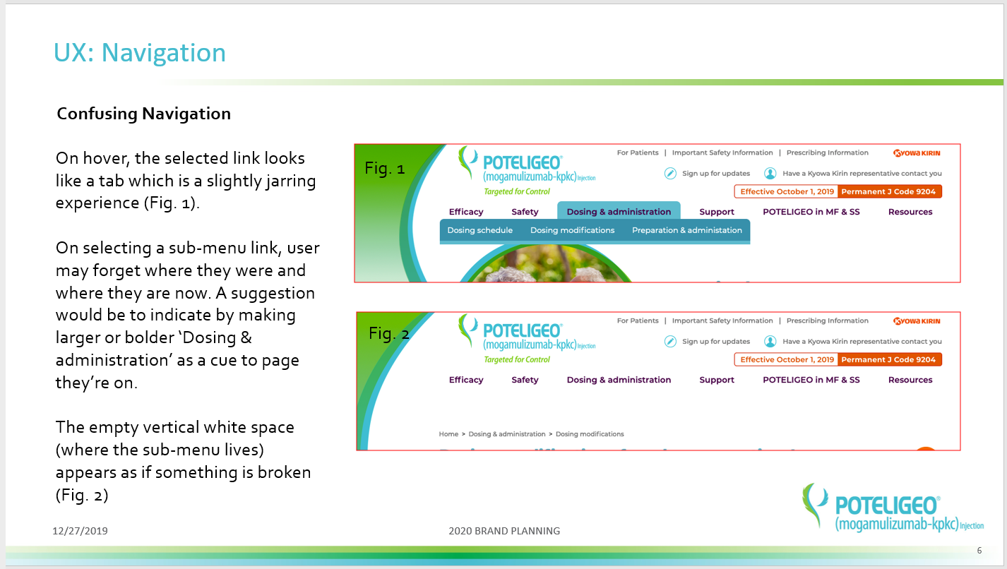
Long navigation links
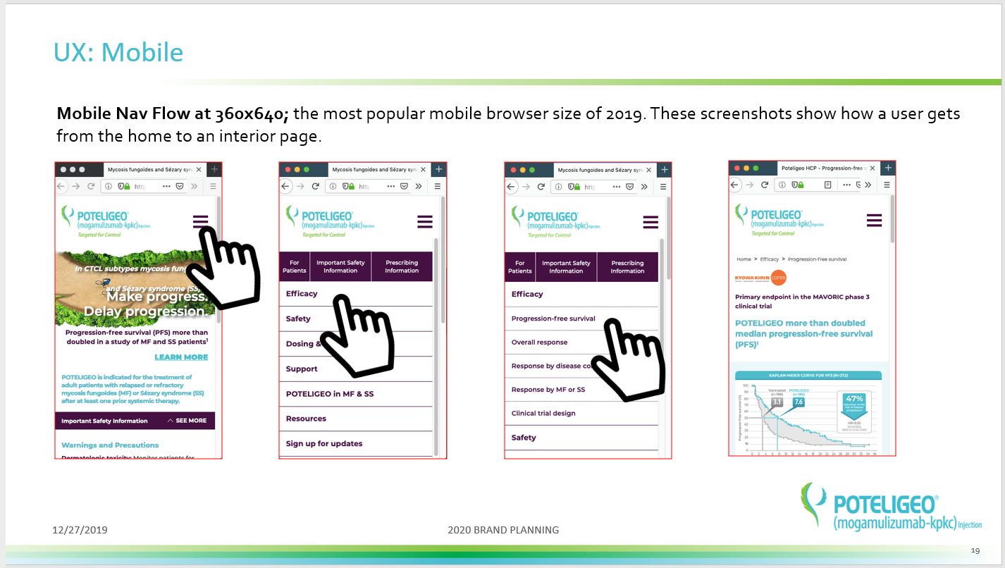
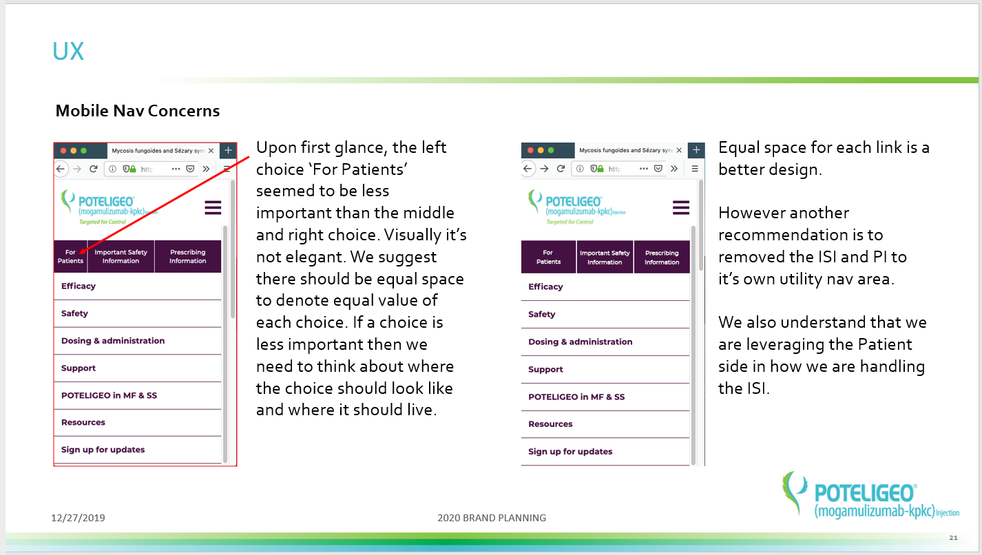
Awkward breakpoints
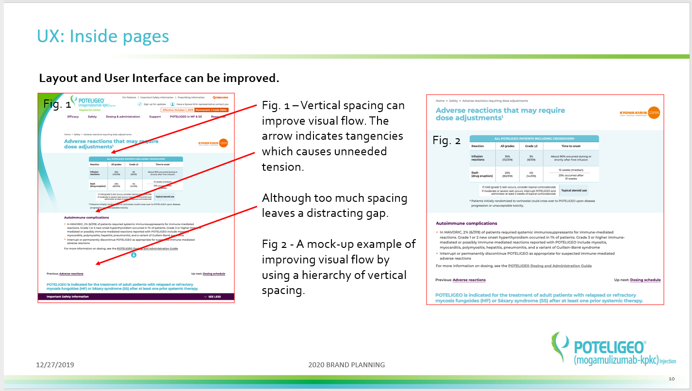
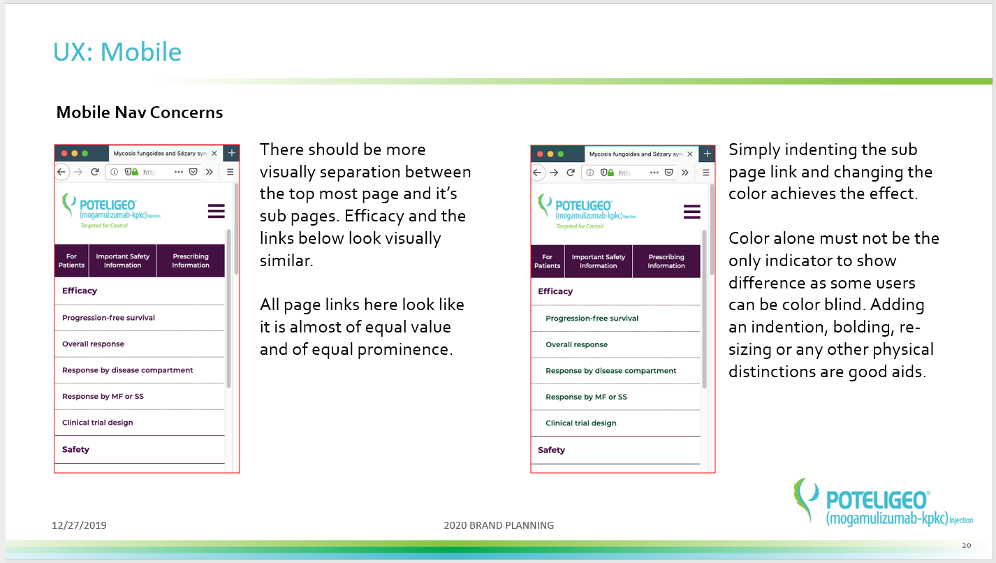
Lack of visual hierarchy
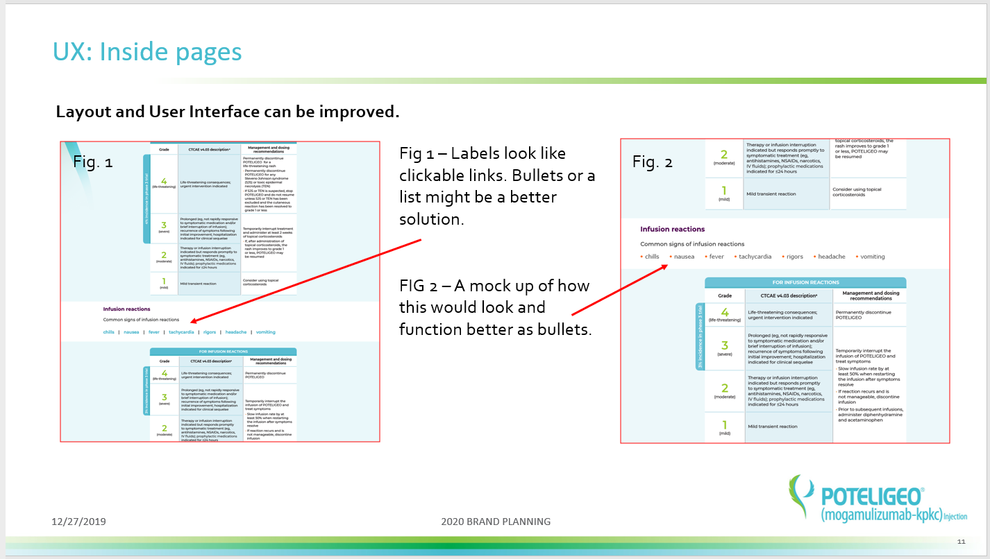
General inconsistences
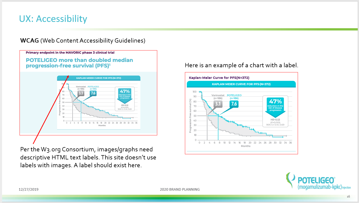
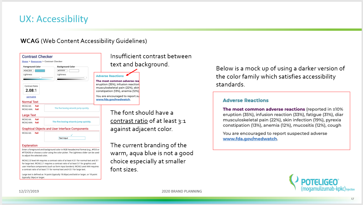
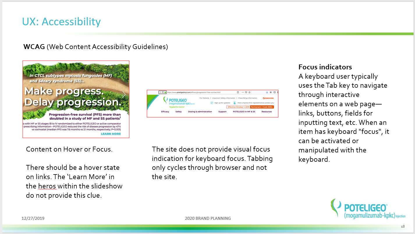
Non-complaint to WCAG
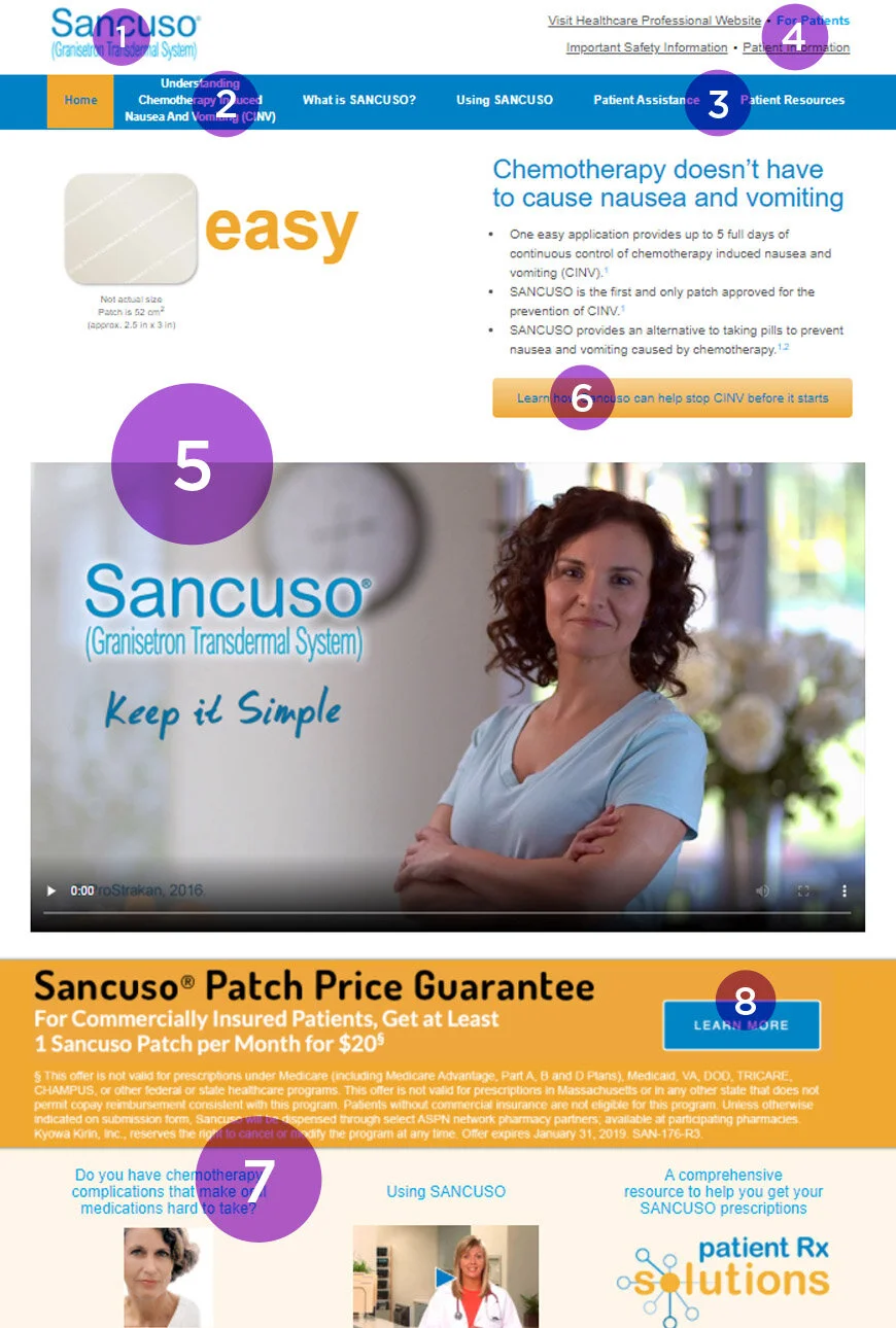
1. Move logo into nav area freeing up valuable real estate
2. Excessive link name
3. These pages can be consolidated into one
4. Cluttered utility nav section
5. The Easy Patch animation is clunky and can be relocated to raise product video
6. CTA treatment and location can be improved
7. Excessive link name
8. CTA treatment and location can be improved
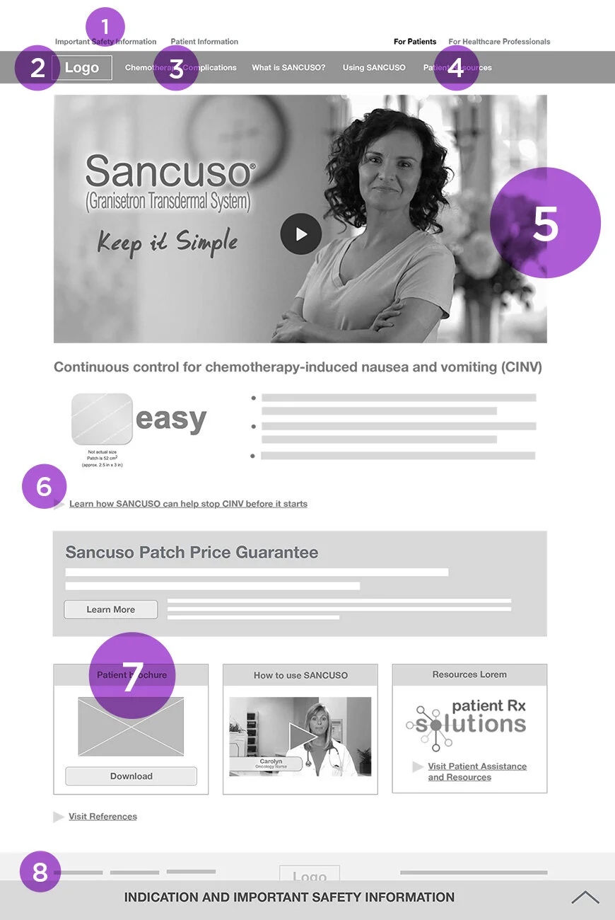
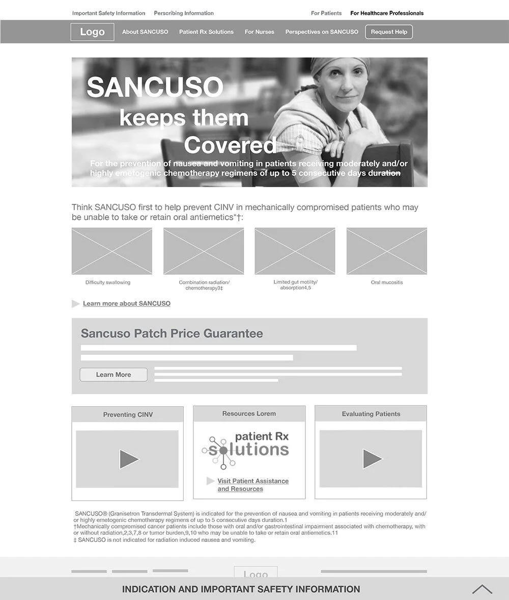
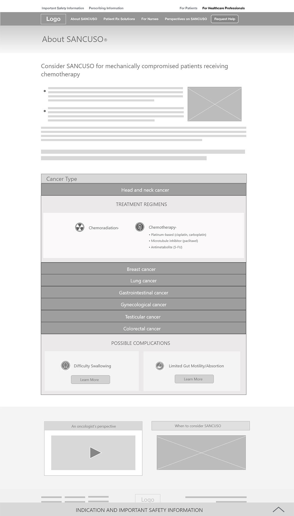
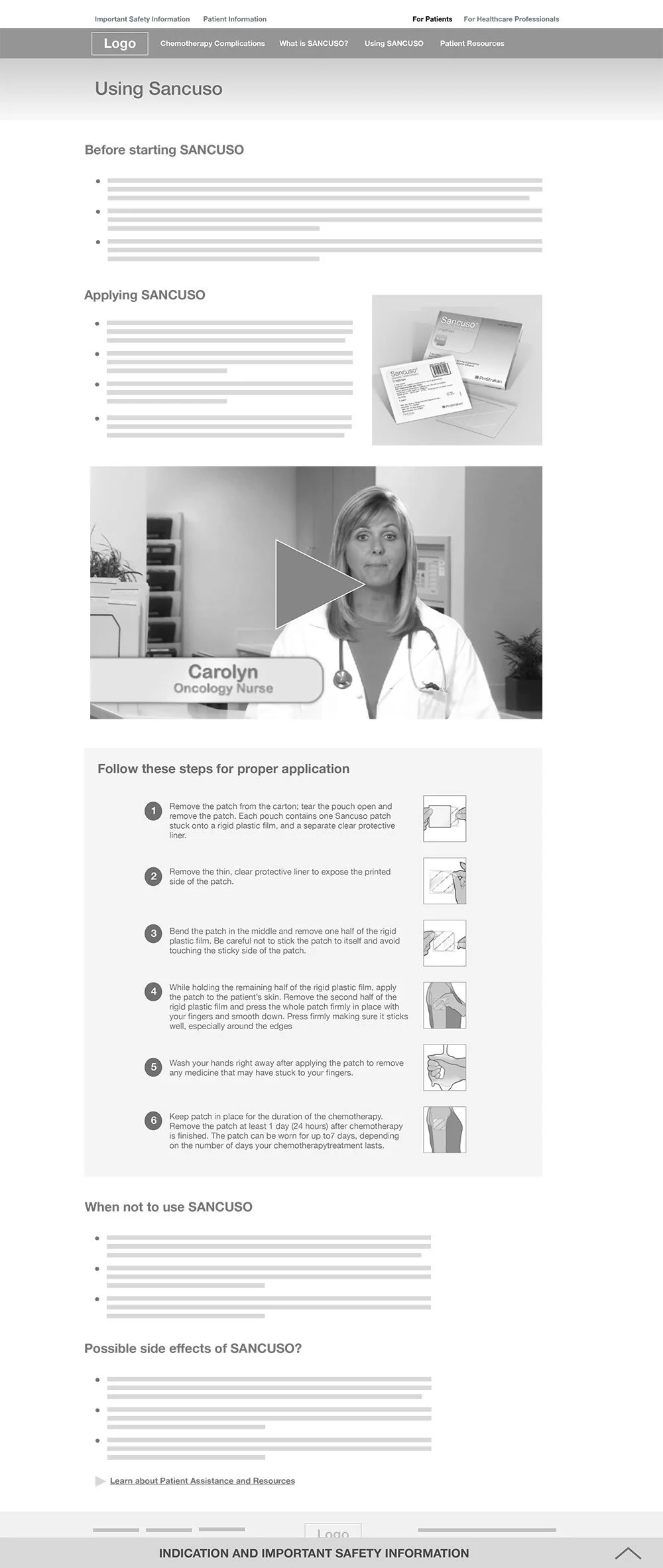
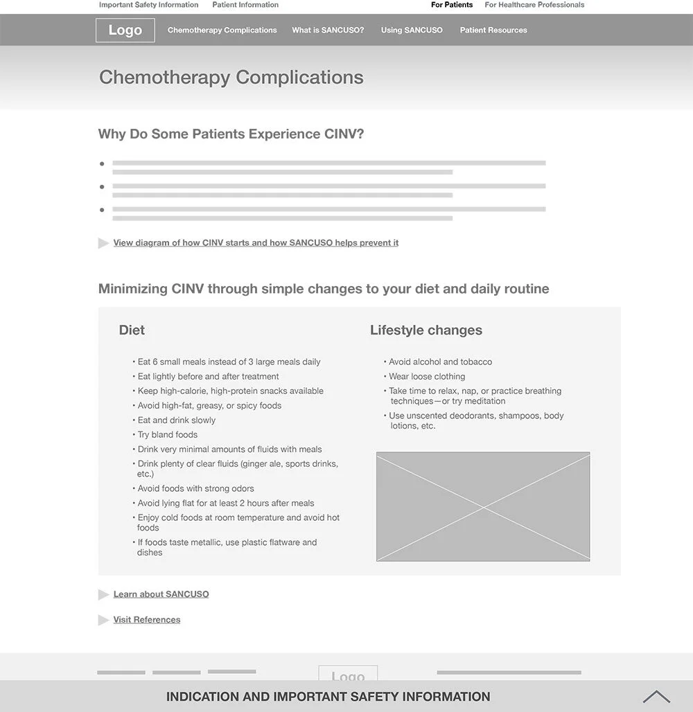
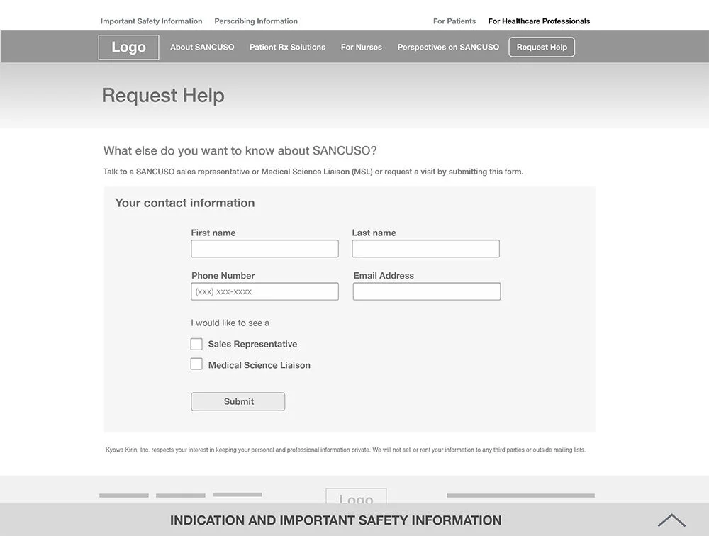
1. Utility nav reduced to one line
2. Logo brought down in place of ‘Home’ button
3. Page re-named and shortened
4. Patient Assistance and Patient Resources combined and renamed
5. Video brought up; animation and page header moved down
6. Hierarchy of buttons and links established—CTA will use bittons, and URL links will be in hyperlink format with iconography treatment
7. Label renamed
8. Updated ISI treatment

